
The July 29, 2026 new-release cycle offers a particularly strong reminder that comic-book covers still do important work. Before a reader samples the story, the cover has to establish a mood, signal a genre, and sometimes make a familiar character feel new again. This week’s standout images range from cozy superhero domesticity to cosmic horror, western noir, mutant mayhem, and surreal science fiction.
Familiar heroes, unexpected moods
Rahzzah’s variant cover for Batman / Superman: World’s Finest 2026 Annual #1 finds Bruce Wayne and Clark Kent in an almost aggressively wholesome moment. Batman is wearing a robe, Superman has a head wound, and both heroes look as if they have just survived something considerably less peaceful than the scene suggests.
That contrast is the cover’s secret weapon. The vintage costumes and small-town Americana atmosphere recall an idealized version of superhero history, while the torn fabric and injuries remind us that this is still a dangerous world. Bruce keeping his cowl on adds another layer of comic absurdity and emotional distance. Even the background collection of bobbleheads becomes part of the joke. It is a warm image, but not a simple one.
Lesley “Leirix” Li takes a similarly playful approach with DC’s Hawk-Girl Summer #1. The Bat-Family has been relocated to the beach, complete with a Batman-themed blanket, a sand sculpture in the Dark Knight’s likeness, and carefully selected costume details that identify each character even while they are dressed for the sun.
What makes the image work is that it understands the appeal of a seasonal anthology. These stories give larger-than-life characters permission to relax, be silly, and exist outside their usual mission-driven routines. The cover’s humor never feels disconnected from the characters. Batman may refuse to visit the beach, but apparently his sand-based proxy is willing to make the trip.
Marvel turns the dial toward danger
Peach Momoko’s variant for Queen in Black #1 immediately communicates that this is not another straightforward hero-versus-villain conflict. Marvel’s event brings Hela and Knull into a collision involving symbiotes, cosmic power, and a universe caught between competing evils. The official series is written by Al Ewing with art by Iban Coello, and its central appeal is the instability of that moral equation.
Momoko’s interpretation of Hela leans heavily into that uncertainty. The character’s expression is more unsettling than the symbiote-infested armor surrounding her. Is she empowered, corrupted, exhausted, or simply enjoying the chaos? The cover refuses to settle the question. That ambiguity is valuable for an event comic, where the broad outlines of the conflict are often known before the first issue arrives.
Mike Mignola’s variant for Rocket Raccoon: Rocket Rewind #1 takes the opposite route, using nostalgia as its main source of energy. Marvel is celebrating five decades of Rocket stories, and Mignola’s cover feels built from retro science-fiction memories: an unusual spacesuit, an oversized weapon, an aquatic setting, and a Rocket who exists somewhere between naturalistic animal and animated mascot.
The image does not imitate one specific era so much as recreate the feeling of old science-fiction adventure. Mignola’s heavy shapes and strange visual atmosphere make the familiar character seem like he has wandered in from a forgotten television serial. It is a fitting approach for a celebration of Rocket’s long history without trapping him in the past.
Horror finds new shapes in the independent books
The Patron #1 may have the week’s most conceptually loaded cover. John Pearson’s variant is constructed as a patchwork of artistic styles and recognizable visual references, a natural fit for a series about a wealthy patron who murders artists to increase the value of their work.
The premise gives the artwork plenty to explore, but the cover does more than advertise a murder mystery. Its fragmented design suggests the unstable relationship between art, ownership, fame, and legacy. The allusions to paintings such as Starry Night and The Scream create an immediate cultural vocabulary while also making the composition feel like evidence from a crime scene. The series comes from writer Christian Ward and artist John J. Pearson, with Ignition Press positioning it as a thriller at the intersection of art and commerce.
Mark Chiarello’s variant for The Dirt Beneath the Devil #1 relies on familiar western imagery, but the execution gives those elements an ominous charge. A lone woman, a horse, a firearm, frontier buildings, and a palette of black and orange establish the setting quickly. The image has the look of an old painting viewed under uneasy circumstances, as if the landscape is preserving a secret.
That balance between recognition and unease is important for a new genre series. The cover promises a frontier story, but it also hints that the expected western elements may be only the surface. The result is an inviting image with just enough wrongness to suggest that the journey ahead will involve more than horses and gunfights.
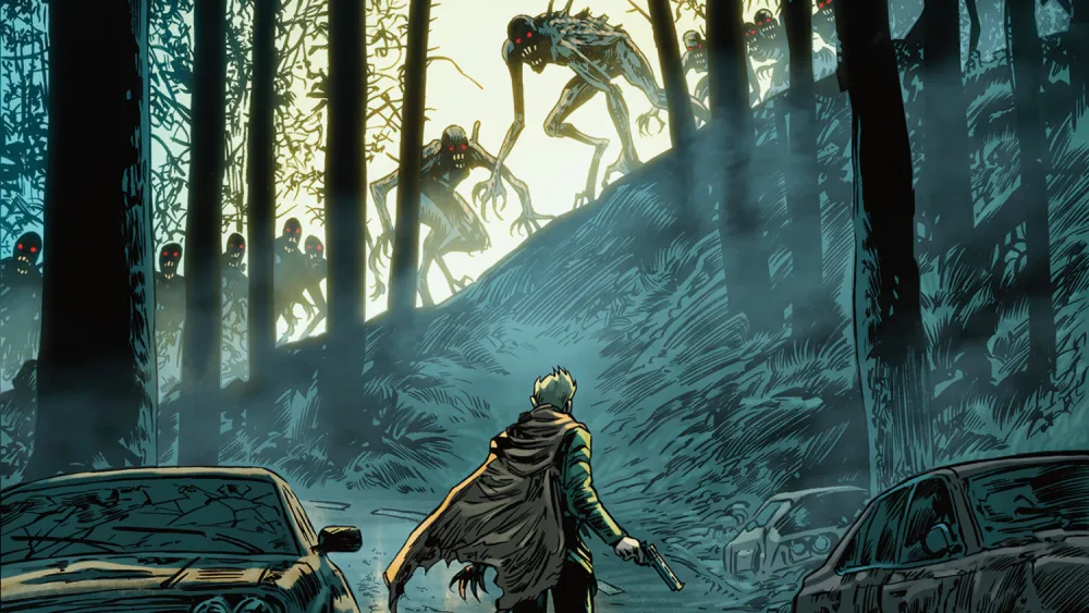
Stefano Raffaele’s cover for Only The Savage Are Left #2 turns a post-apocalyptic monster encounter into something almost spiritual. The protagonist faces former humans transformed by a rage-inducing virus, yet the composition does not focus solely on panic. Light surrounds the creatures, the environment feels cold and still, and the road appears to stop without truly ending.
That gives the cover a strange sense of acceptance. It is not necessarily hopeful, but it suggests inevitability: the characters are moving toward something that cannot be avoided. In an action-horror series, that reflective quality adds welcome weight to the premise.
New worlds and dangerous reflections
Joe Bocardo’s variant for Black Star #1 uses a double image to introduce a story built around identity, magic, and hidden power. The Titan Comics series is co-written by Kristin Kreuk, Peter Mooney, and Eric Putzer, with Bocardo providing the interior art. Its setting, rooted in the early nineteenth-century fur trade, gives the cover an unusual historical foundation for a supernatural noir.
The competing reflections are familiar imagery, but Bocardo keeps the effect restrained. The surrounding cold, the suggestion of a distant city, and the tension between wilderness and civilization create the feeling of a mystery that will unfold gradually. Rather than presenting every supernatural idea at once, the cover lets the setting do much of the work.
Fred Harper’s The Toxic Avenger #10 cover is far less restrained, and that is exactly why it succeeds. Harper’s Toxie remains gloriously unpleasant to look at, with a lumpy, exaggerated physique that makes the character feel like a deliberately warped action figure. The close encounter with a robotic enemy also disrupts the usual language of superhero combat.
There is something almost intimate about the confrontation, which makes the scene more disarming than a standard punch-up. Harper understands that The Toxic Avenger works best when disgust, humor, violence, and attraction occupy the same visual space. The cover is ugly in the most purposeful way possible.
Taken together, this week’s selections show how much variety a strong cover lineup can contain. Some images sell comfort, some promise danger, and others simply ask readers to look twice. In each case, the cover is doing more than decorating the comic. It is establishing an argument for why the story deserves a place on the stack.
Sources
aiptcomics.com
marvel.com
prhcomics.com
titan-comics.com